Introduction
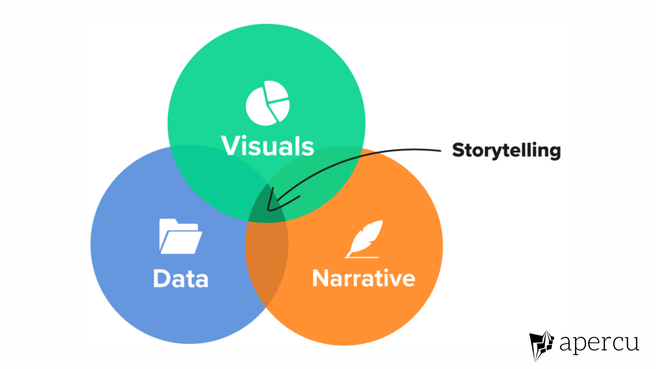
In this blog post, we look at another instalment in our ongoing series on Data Storytelling. Earlier in this series, we looked at Telling Stories with Data: An Essential Skill for Everyone, Steps for Effective Data Storytelling, and Data Storytelling- A Case Study 1
Today we would consider yet another Case study: “How to forecast an American’s vote.”
About the case study
The Economist’s “How to Forecast an American’s Vote” is an excellent case study in data storytelling. The article investigates the factors that affect a voter’s preference in the United States using a variety of interactive graphics.
The use of data storytelling in the article is particularly noteworthy since it successfully communicates complicated ideas and statistics in an engaging and informative manner. Additionally, while the story is told using charts, the data in the charts represent the outputs of a statistical model. Therefore, the story demonstrates how statistical modelling or machine learning can be coupled with data visualization to make for an interesting data story.
Evidence
The data for this story was sourced from a collaborative effort between The Economist, a reputable, global news publication, and YouGov, a well-known polling organization. Since April 2017, they have conducted weekly surveys of 1,500 Americans, providing a substantial and robust dataset for analysis. The Economist has a long-standing history of delivering accurate and unbiased reporting, while YouGov is recognized for its rigorous methodology in conducting surveys and polls. Together, these organizations lend a high level of credibility to the data and instil confidence in the reliability and accuracy of the findings.
Narrative
The story unfolds in a structured sequence, seamlessly guiding readers through various aspects of voter behaviour analysis. It begins with an engaging introduction that sets the stage by highlighting the contradiction between the historical vision of America’s founding fathers and the contemporary trends in voter decision-making. This introduction provides tension that the reader has to resolve by reading further.
As the narrative progresses, the story provides evidence for the claim made in the introduction by showing how various social characteristics influence voting. For instance, rural and urban dwellers are compared as well as married and unmarried people.
This sequential approach helps to build a logical progression, with each section building upon the last. Transitions between segments are facilitated by clear and concise headings, providing a roadmap for readers to follow. Additionally, key phrases like “noteworthy discovery” and “intriguing contrast” serve as signposts, guiding the reader’s attention and creating a smooth transition from one part of the story to the next. Overall, the combination of well-structured headings and strategic use of descriptive phrases ensures a seamless flow from one section to another, facilitating a comprehensive understanding of the complex dynamics at play in voter behaviour.
Visuals
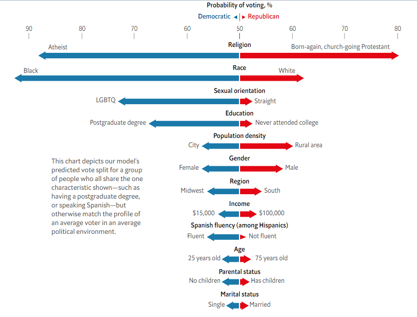
The article is a good illustration of how diverging bar charts can be used in data storytelling. The diverging bar chart works well in the article because it allows the reader to clearly see how each factor affects the outcome (voting choice). Additionally, the diverging bar chart is appropriate because the article considers only two outcomes.
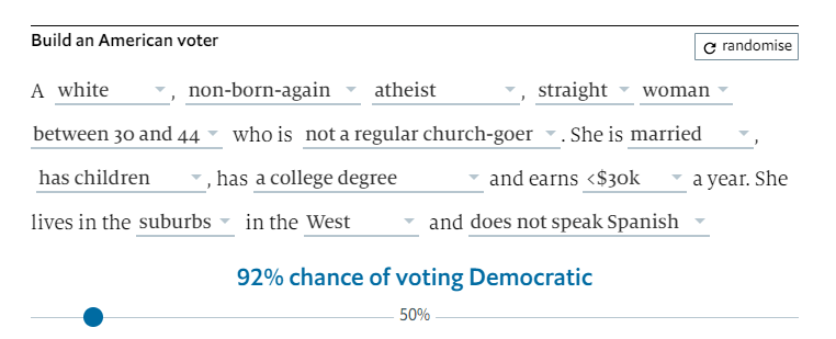
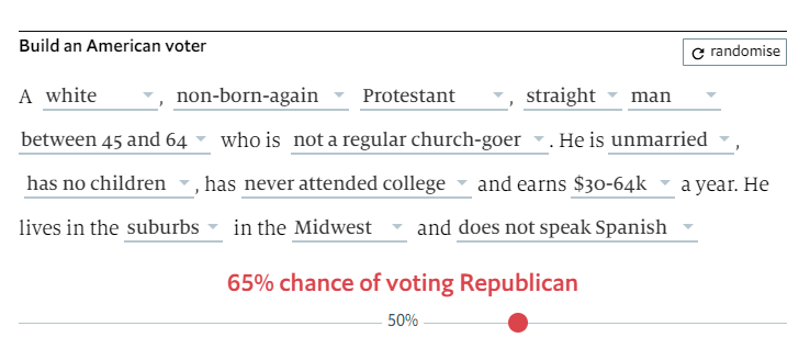
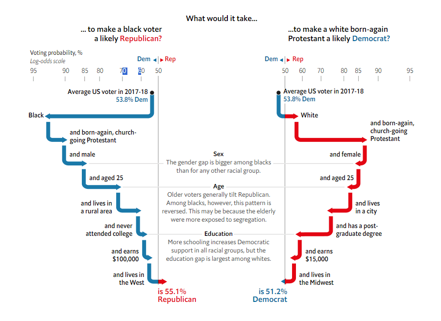
Another intriguing visual element featured in the article can be found below. Although it doesn’t take the form of a conventional chart, it serves as an interactive tool, allowing readers to engage with the statistical model employed by the authors. By altering any of the inputs in this visual, readers can influence the predicted voting outcomes, creating an interactive data narrative that enhances the reader’s understanding of the story.
The use of colour is deliberate in the article, with contrasting hues employed to highlight significant trends or disparities. For instance, in the chart depicting the influence of urban versus rural living on political leanings, specific colours distinguish between the two groups, making the comparison easily discernible. Additionally, the size and positioning of the visuals are thoughtfully considered to ensure they align with the corresponding text, allowing the reader to seamlessly transition between the narrative and the visual representation of data.
This visual integration not only breaks up the text, enhancing readability but also provides a visual anchor for the information, reinforcing key takeaways and bolstering the reader’s comprehension of the intricate voter behaviour analysis presented in the article.
Conclusion
This case study shows how a news article can be made more compelling and engaging by using data storytelling techniques. Additionally, while most data stories only use graphs and text, this case study demonstrates a very creative use of statistical modelling in data storytelling. Finally, this case study shows the importance of using the right charts and colours in your data stories.
If you want help with converting your work reports to engaging data stories, click here.