

So far, this series has looked at defining data storytelling and outlining the steps to take when developing data stories. In this article, we will look at a sample data story and identify essential lessons we can learn.
ProPublica’s data visualization project aims to raise awareness about the ongoing global extinction problem by highlighting species that have become extinct since the year 2000, as well as those that are currently critically endangered or susceptible to extinction. The project uses data from the International Union for Conservation of Nature (IUCN) to build an interactive website that allows visitors to examine the data in various ways, including by taxonomic group, area, and cause of extinction. The project emphasizes the critical importance of conservation and environmental protection efforts in addressing the challenge of global biodiversity loss.
Evidence
The International Union for Conservation of Nature (IUCN) database is used in the ProPublica Extinctions project, which is a worldwide acknowledged and regarded authority on species conservation. The Red List of the IUCN is a comprehensive inventory of species conservation status updated regularly based on scientific evidence and expert evaluations.
The IUCN’s rigorous technique for assessing species conservation status includes elements such as population size, range, and threats to survival. To ensure accuracy and consistency, the assessments are carried out by a network of experts and assessed by an independent panel of scientists.
Given the IUCN’s standing and repute in the scientific world, the data used in the ProPublica Extinctions project is very reliable. As a result, the findings of the project provide vital insights into the ongoing worldwide extinction problem, as well as the critical need for conservation and environmental protection initiatives to solve this issue.
Narrative
The ProPublica Extinctions project raises awareness of the subject of global species extinction using an interactive data visualization style. The article begins by asserting that the rate of animal species extinction is on the rise, creating immediate tension and piquing the reader’s interest. The introduction wraps up by highlighting the percentages of species facing extinction within various animal classes.

The website uses interactive UI features such as clickable buttons, drop-down menus, and hover-over effects to advance the narrative. These elements promote user exploration and guide the user through the facts in such a way that the seriousness of the extinction catastrophe is highlighted. Furthermore, descriptive terms and classifications like “extinct species,” “critically endangered,” and “vulnerable” help users comprehend the conservation status of various species.

Visually, the project incorporates images of extinct or endangered species, as well as graphs and charts that show trends in extinction rates. The website’s style is user-friendly and clean, with a simple design that emphasizes the relevance of the data and the urgency of the situation.
Visuals
To effectively convey information and captivate the audience, the article utilizes a variety of visual aids. It incorporates images of extinct or endangered animals, providing viewers with a visual depiction of the global biodiversity crisis. These pictures are often complemented by informative text, including scientific names and explanations for the population decline. Furthermore, each photograph corresponds to the specific animal class represented in the data

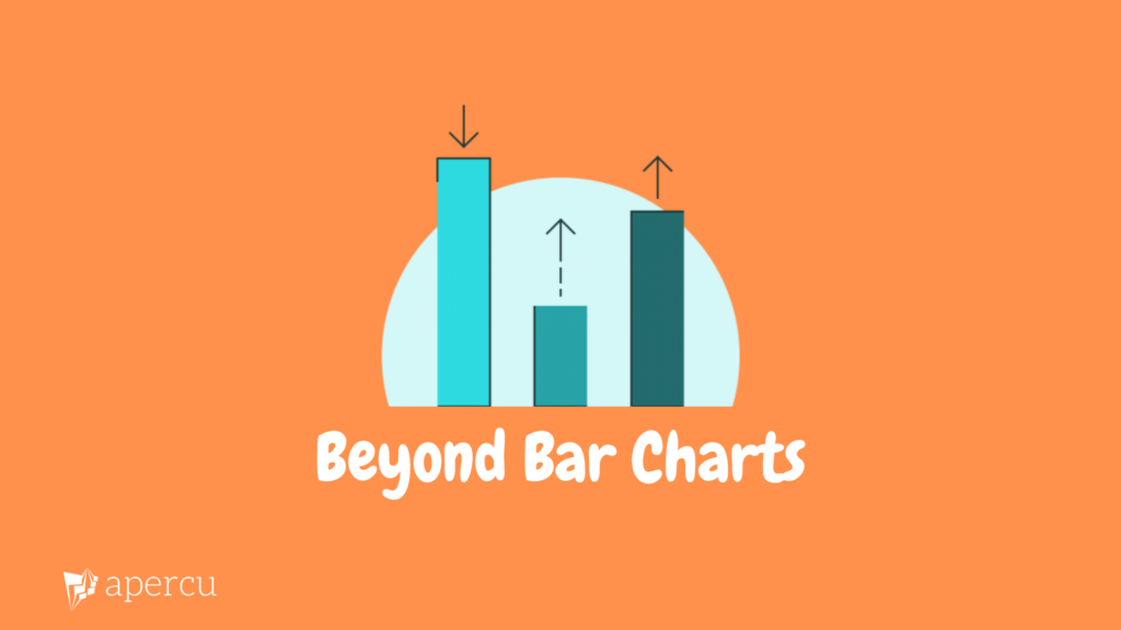
Secondly, the project primarily uses a stacked bar chart to display trends in the data. A stacked bar chart is useful here because it allows for the data to be presented in such a way that one can see the composition of a family of animals and compare how close each species is to extinction.

Thirdly, the project offers various interactive features to assist users in exploring the data. For instance, the search bar allows users to determine the likelihood of specific animals facing extinction. Additionally, there are several callouts that draw attention to particular subgroups, such as bats and parrots. Lastly, a vertical bar is available for users to navigate through the data systematically

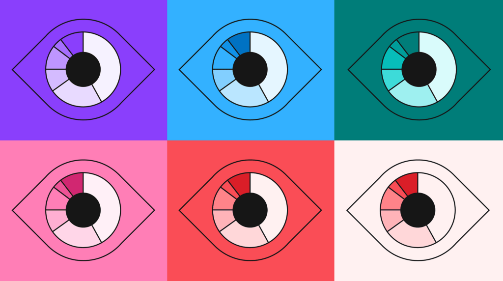
Finally, colour is extensively used in the project to help distinguish between the status of each species. Species of “least concern” are highlighted with grey, while species of “critically endangered” are marked with red.

Conclusion
This case study demonstrates how data stories can be made more interactive with web technologies. Additionally, in addition to graphs and text, this case study demonstrates a very creative use of photography in data storytelling. Finally, by using a stacked bar chart, the project is able to show multiple dimensions of the data simultaneously. This demonstrates the importance of picking a chart that is aligned with the data and the goal of the data story.
If you want help with converting your work reports to engaging data stories, click here.

Comments are closed.