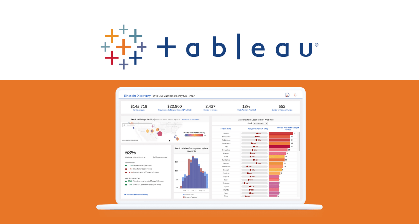
Data visualization is a process that transforms raw data into meaningful insights. Tableau is a user-friendly and powerful data visualization tool that allows you to create stunning visualizations without extensive programming knowledge. In this beginner’s guide, we’ll walk you through the basics of Tableau and show you how to create insightful visualizations.

Whether you are a data analyst, a business professional, or simply someone who wants to explore data in a visually appealing way, Tableau is the perfect tool for you. With its drag-and-drop interface and intuitive features, you can easily import data from various sources and start building interactive dashboards and charts. By the end of this guide, you’ll have the skills to present your data in a way that is not only visually appealing but also helps you uncover hidden patterns and trends. Get ready to embark on a journey of data exploration and storytelling with Tableau!
Installing Tableau
Before we begin, make sure you have Tableau Desktop installed on your computer. You can download a trial version from the official Tableau website. Once you have downloaded and installed Tableau Desktop, you will be able to access its powerful features and tools for data visualization and analysis. This software is essential for creating interactive dashboards, reports, and charts. With Tableau Desktop, you can easily connect to various data sources, manipulate data, and create stunning visualizations to gain valuable insights from your data.
Connecting Your Data
Tableau supports a wide range of data sources, including Excel, CSV, databases, and more. Let’s start by connecting Tableau to a sample dataset.
- Launch Tableau Desktop.
- On the start page, select the data source you want to connect to (e.g., Excel, CSV, etc.).
- Locate and select your dataset.
Building Your First Visualization
Now that you’ve connected Tableau to your data, let’s create a simple visualization. To create a simple visualization in Tableau, you can start by dragging and dropping the desired fields from your data onto the canvas. You can choose from a variety of chart types, such as bar graphs, pie charts, or line graphs, depending on the type of data you want to visualize. Once you have selected a chart type, you can customize it further by adjusting the colours, labels, and formatting options to make it visually appealing and easy to interpret.
Example: Creating a Bar Chart
Using the sample superstore dataset which you can download here
- Drag and drop:
- Locate the “Dimensions” and “Measures” panes on the left side of the Tableau interface.
- Drag the “State” dimension to the Rows shelf.
- Drag the “Sales” measure to the Columns shelf.
- View the Visualization:
- You should now see a bar chart representing sales by state.
- Customize
- You can further customize your visualization by adjusting colours, labels, and other settings.
Adding Interactivity
Tableau allows you to add interactivity to your visualizations, making it easier for users to explore the data. They can drill down into specific regions or zoom in on certain time periods to gain a deeper understanding of the sales trends. Additionally, Tableau offers various chart types and customization options, allowing users to create visually appealing and informative visualizations. This interactive and customizable feature of Tableau enhances the user experience and facilitates data exploration and analysis.
Example: Adding a Filter
Let’s add a filter to our bar chart to allow users to view sales for specific regions. This added filter functionality will enable users to easily narrow down their analysis and focus on specific regions of interest. By selecting a specific region, users can quickly compare and analyze sales performance over different regions and identify any patterns, trends, or anomalies. This enhanced level of data exploration and analysis further empowers users to make informed business decisions based on their specific needs and objectives.
- Drag and drop:
- Drag the “State” dimension to the Rows shelf.
- Drag the “Sales” measure to the Columns shelf.
- Drag the “Region” dimension to the Filters shelf.
- Select “Region”:
- In the filter window, select the regions you want to include.
- Apply Filter
- Click “OK” to apply the filter.
Now, users can interact with the visualization by selecting specific regions.
Saving and Sharing Your Work
- Save Workbook::
- Click on “File” in the top-left corner and select “Save As”.
- Choose a location and enter a name for your workbook.
- Export as Image or PDF:
- You can also export your visualization as an image or PDF by selecting “Export As” under the “File” menu.
Conclusion
Congratulations! You’ve just created your first data visualization using Tableau. This beginner’s guide covers the basics of connecting to data, building visualizations, adding interactivity, and saving your work.
As you continue to explore Tableau, you’ll discover more advanced features and techniques to create even more powerful visualizations. Keep experimenting with different datasets and visualization types to sharpen your skills.
Check out our post on the Ethics of Data Visualization


