Data visualization is a powerful tool for conveying insights and telling compelling stories with data. While bar charts and line graphs are familiar and effective, other visualization techniques can bring new levels of depth and clarity to your data analysis.
Other techniques like heat maps, treemaps, and network graphs can effectively represent complex relationships and patterns. By utilizing these innovative visualization techniques, analysts can uncover insights that may have been missed with traditional charts and graphs. Additionally, these visualizations can captivate audiences and make data more accessible and engaging.
In this blog, we’ll delve into some of these techniques, providing examples and explanations to inspire your data visualization endeavours.
1. Heat Maps and Treemaps
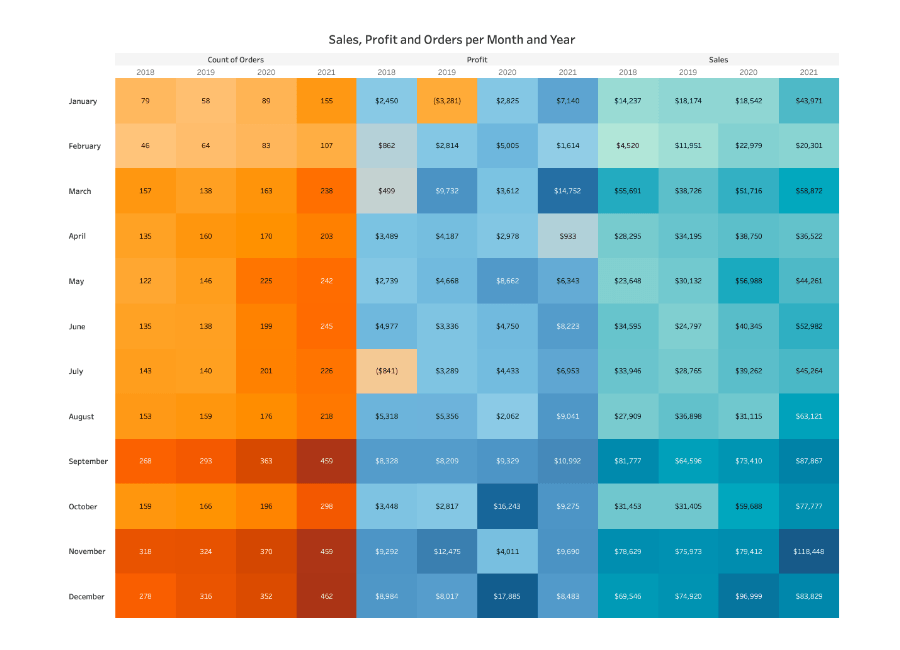
Heat Maps:
Heat maps use colour gradients to represent data values in a matrix. They are particularly effective for visualizing large datasets and identifying patterns or correlations. By assigning different colours to various data values, heat maps make it easier for users to quickly grasp information and spot trends. The colour gradient provides a visual cue, where warmer colours like red or yellow represent higher values, while cooler colours like blue or green represent lower values. This visual representation allows analysts and researchers to explore complex datasets and draw insights with relative ease.
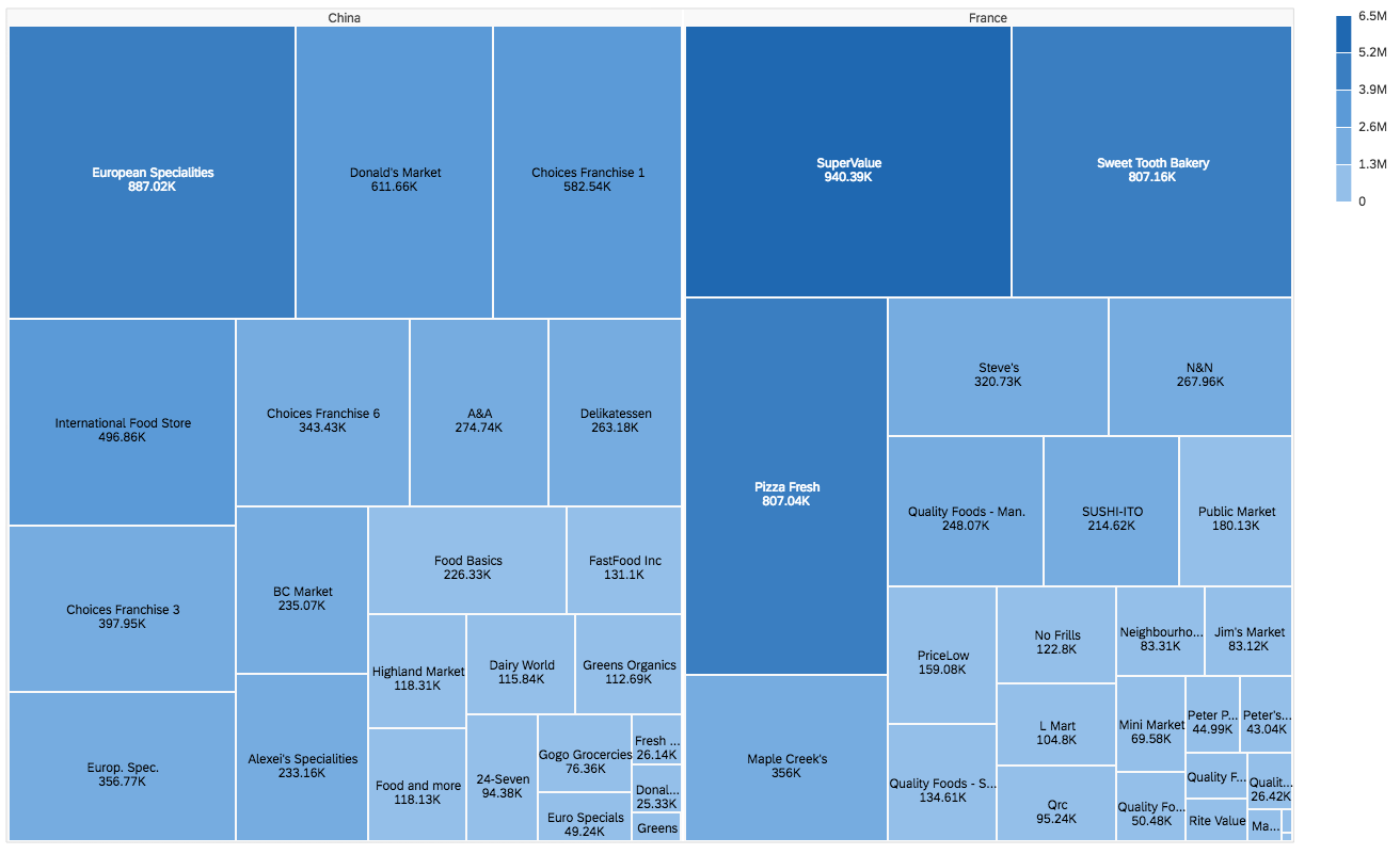
Treemaps:
Treemaps display hierarchical data using nested rectangles. Each rectangle’s size and colour represent specific metrics. For example, in a treemap representing sales data, the size of each rectangle could represent the revenue generated by a specific product category, while the colour could represent the profit margin. This visual representation allows users to quickly identify patterns and trends in the data, such as which product categories are the most profitable and which ones are underperforming. Treemaps are widely used in various industries, including finance, marketing, and data analysis, to facilitate data-driven decision-making and enhance understanding of complex data structures.
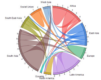
2. Chord Diagrams
Chord diagrams illustrate the relationships between different data points. They are handy for visualizing complex networks or the flow of information. By showing the connections between data points, chord diagrams allow researchers and analysts to identify patterns, clusters, and trends. This visual representation also helps to simplify complex information and communicate it effectively to a wider audience, making it an essential tool for data analysis and decision-making processes.
A chord diagram consists of a grid with horizontal and vertical lines for frets and strings, respectively. Where to place your fingers to create a chord is indicated by dots or numbers on the grid. To help with placement, fingers are numbered (1 for index, 2 for middle, etc.). A curved line designating the fret that will be barred is used to represent barre chords.
Focus on orientation and finger placement in chord diagrams, using tools like dictionaries or apps for practice. Reading diagrams becomes second nature, enhancing fluidity and enjoyment.
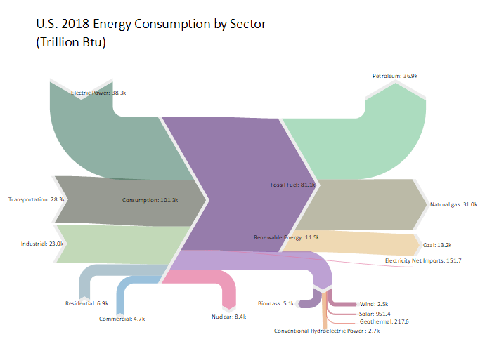
3. Sankey Diagrams
Sankey diagrams display flows and relationships between entities. They are excellent for visualizing processes, resource allocation, or energy flows. Sankey diagrams use arrows of varying widths to represent the quantity or value of a flow. The width of the arrows is proportional to the magnitude of the flow. This makes it easy to compare the relative sizes of different flows and identify any imbalances or inefficiencies in the system. Overall, Sankey diagrams provide a clear and intuitive way to understand complex systems and make informed decisions based on the visualized data.
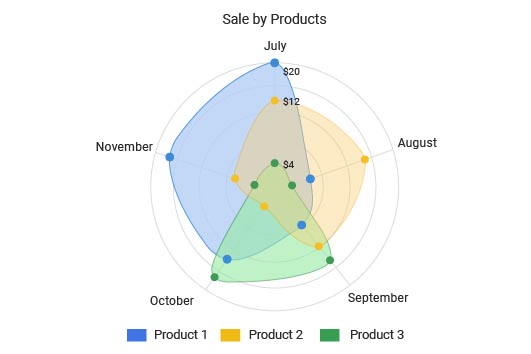
4. Radar Charts
Radar charts, also known as spider or star plots, are effective for visualizing multivariate data in a circular layout. They are particularly useful for comparing the relative performance or characteristics of multiple entities or variables. Each variable is represented by a spoke radiating from a central point, and the data points for each entity are plotted along these spokes. This allows for a quick and intuitive understanding of how different variables interact and contribute to the overall picture.
The radar chart illustrates the sales performance of three products (Product 1, Product 2, and Product 3) across the months of July through November. Each spoke radiates from the center, representing a different month, with the distance from the center indicating the level of sales. Product 1 showed a peak in July, followed by a slight dip in August. This visual representation allows for a quick and effective comparison of the sales performance of each product over the specified time period.
5. Word Clouds
Word clouds visually represent the frequency of words in a text, where the size of each word is proportional to its frequency. Word clouds are a visual tool used to quickly analyze and understand text themes. They display the most frequently used words, making it easier to identify key trends. These clouds can be customized with colours, fonts, and layouts to enhance the visual appeal and engagement of the analysis process. A word’s frequency is inversely correlated with its size within the word cloud.

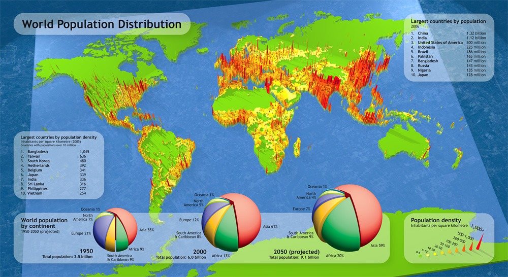
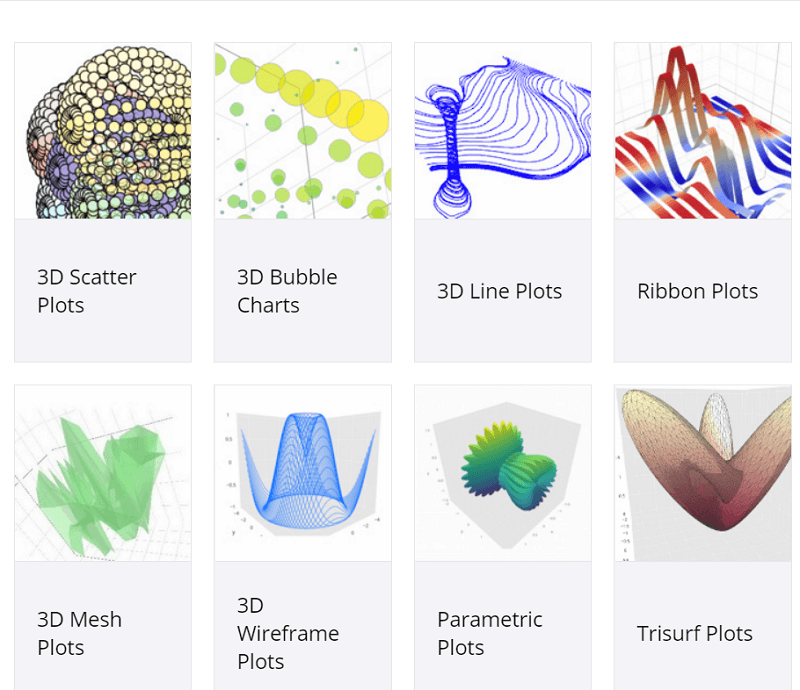
6. 3D Visualizations
While not suitable for all datasets, 3D visualizations can provide a unique perspective, especially for spatial data or complex simulations. 3D visualizations can accurately represent relationships and interactions between geographical elements in spatial data, providing a comprehensive understanding. They also aid in complex simulations involving multiple variables and intricate processes, enhancing the identification of patterns and trends. When used correctly, 3D visualizations can be a powerful tool for gaining insights from complex datasets.
Consider a 3D graph depicting global population density across different regions of the world, with the x-axis representing longitude, the y-axis representing latitude, and the z-axis representing population density. Each point represents a specific geographical location, with height corresponding to population density. This visualization aids in understanding population density variations across different locations, making it useful for urban planning, resource allocation, and demographic studies, providing a clear and intuitive way to analyze and compare global population distributions.
Conclusion
Exploring innovative data visualization techniques opens up possibilities for gaining insights from your data. By choosing the right visualization for your specific dataset and objectives, you can convey complex information in a clear, engaging, and informative way. Remember, the key is to select a visualization that best aligns with the narrative you want to convey and the questions you want to answer.