Data visualization is a powerful tool for conveying complex information in a digestible format. However, to truly unlock its potential, it’s essential to ensure that visualizations are accessible to everyone, including those with disabilities.
In this blog, we’ll explore best practices for creating inclusive visualizations and discuss different aspects of data visualization research to provide valuable insights and information for your audience.
Understanding Accessibility in Data Visualization
Accessibility in data visualization means designing visual representations of data that can be easily understood and navigated by a wide range of users, including those with disabilities. This includes considerations for individuals with visual, auditory, cognitive, and motor impairments.
Designing visualizations with accessibility in mind ensures data interpretation for individuals with visual impairments or colour blindness. Providing alternative text descriptions, high-contrast colours, and interactive features like screen readers or keyboard navigation can enhance accessibility, empowering a broader audience to understand and engage with data.
Best Practices for Inclusive Data Visualization
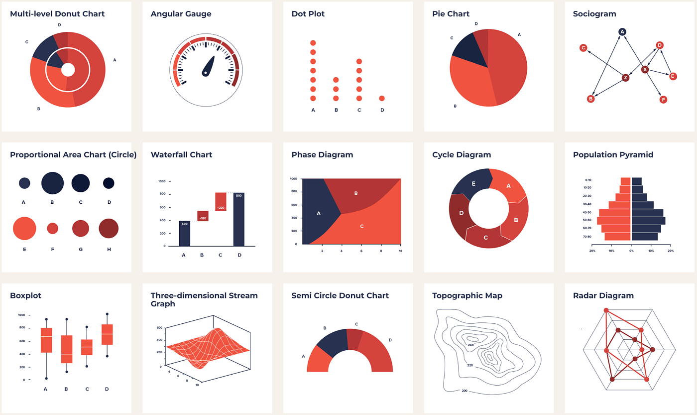
1. Choose the Right Visualization Type
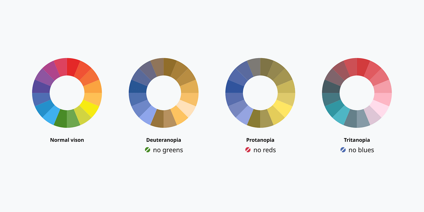
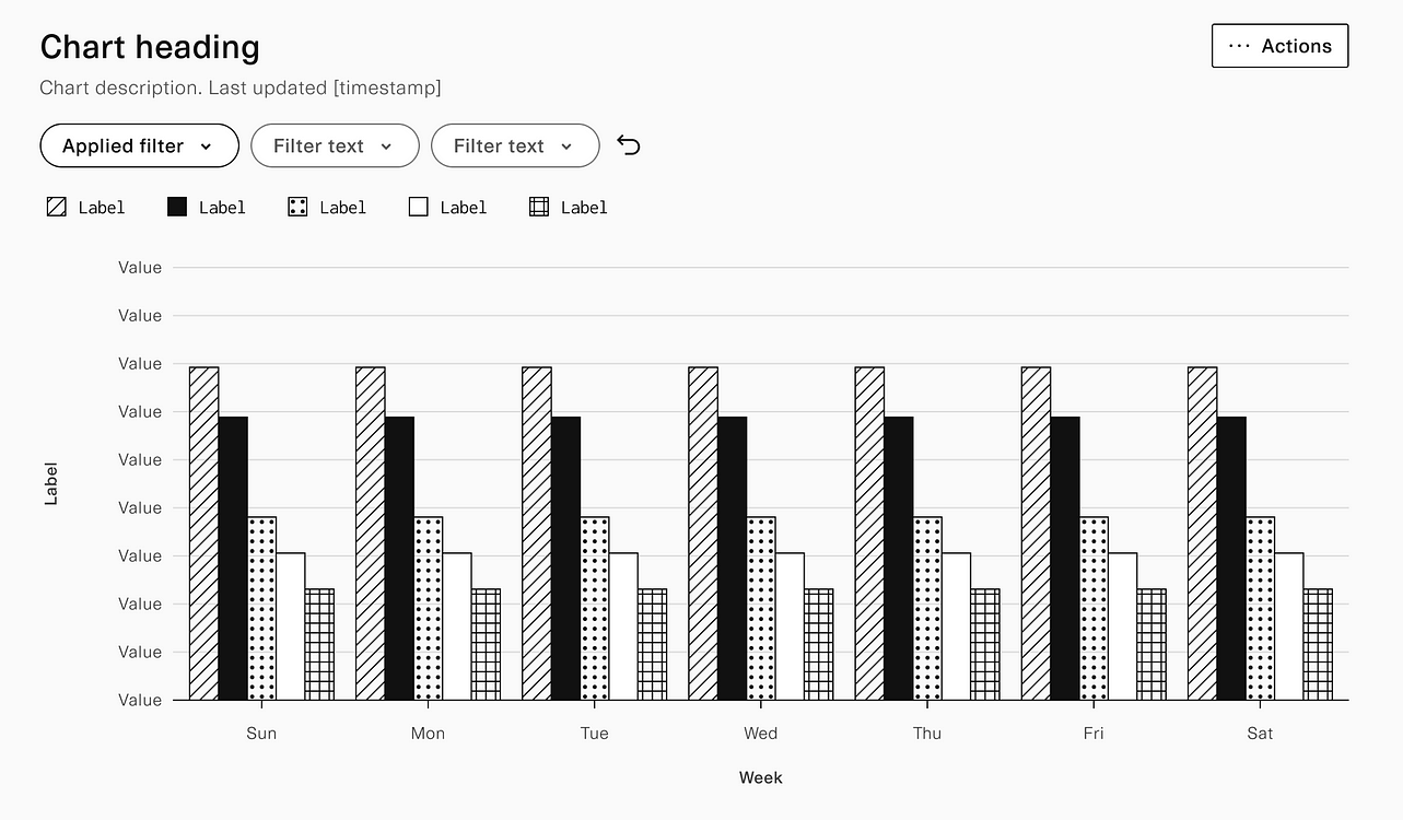
Select visualizations that are suitable for the data and the audience. For example, avoid using colour-based differentiations alone, as this can be problematic for colourblind users. Consider using additional cues like patterns or labels.
Choose visualizations that are easily understood by the intended audience, avoiding complex charts or graphs. Choose simple, intuitive ones that effectively convey data.
Accessible Colors for Data Visualization by Zach Grosser
2. Provide Text Descriptions
Include clear and concise text descriptions for all visual elements. This helps screen readers provide information to users with visual impairments. Clear and concise text descriptions for all visual elements are important to provide information to users with visual impairments.
These descriptions should accurately explain the visual elements in a way that allows users to understand the content of the visuals without relying on their sight. This ensures that all users can access and engage with the information presented, promoting inclusivity.
3. Use High Contrast Colors
Ensure that there is a strong contrast between text and background colours. This benefits users with low vision and helps improve readability for everyone.
By using high-contrast colours, users with low vision will be able to easily distinguish between the text and the background. This will improve their reading experience and make it more accessible for them. Additionally, high contrast colours also improve readability for all users, as it makes the text stand out and prevents any strain on the eyes while reading.
4. Offer Alternative Text for Images
For non-text elements like images, charts, or graphs, provide alternative text (alt text) that conveys the content and context to users who may not be able to see the visual. This is important for individuals who have visual impairments.
Alt text should be concise and descriptive, providing the necessary information without being too lengthy. It is also advisable to use keywords and phrases that are relevant to the visualization, ensuring that users can understand the purpose and meaning behind it.
5. Consider Navigation and Interaction
Make sure that users can navigate through the visualization easily, using both keyboard controls and screen reader support. Provide clear instructions for interactive elements.
Use meaningful labels for buttons, links, and menus to ensure users can understand their purpose. Additionally, consider implementing a logical and intuitive layout, with consistent navigation patterns, such as a menu bar or sidebar, for easy exploration. Providing tooltips or explanatory text for complex features can also enhance user understanding. Ultimately, prioritizing accessibility and clear instructions will ensure a seamless and user-friendly experience for all users.
Visually Accessible Data Visualization by Derek Torsani
6. Utilize Responsive Design
Ensure that visualizations are responsive and adapt well to different screen sizes and devices. This benefits users who may access the content on various platforms.
Responsive visualizations are crucial in today’s digital landscape where users consume content on a wide range of devices, from smartphones to tablets and desktops. By adapting well to different screen sizes, visualizations provide an optimal viewing experience, ensuring that users can easily interact with and interpret the data regardless of the platform they are using. This not only enhances user satisfaction but also increases the accessibility and reach of the content.
7. Avoid Flashing or Rapid Animation
Flashy or rapidly moving elements can trigger seizures or discomfort for some users. Use animations sparingly and ensure they can be paused or turned off.
Consider the impact on individuals with photosensitive epilepsy or sensory processing disorders when incorporating animations into your design. It’s important to prioritize inclusivity and provide users with the option to control the animation speed or disable it altogether. This helps create a more accessible and user-friendly experience for everyone. Remember, a considerate design approach is essential to ensure the comfort and safety of all users.
8. Provide Accessible Documentation
Alongside the visualization, offer accessible documentation that provides additional context, explanations, and interpretations of the data.
This documentation will be crucial for users to fully comprehend the importance of the data presented in the visualization. By offering accessible explanations and interpretations, users can gain a deeper understanding of the trends, patterns, and insights derived from the data. Moreover, providing additional context will help users make informed decisions based on the visualization, ensuring its practical value is maximized. Overall, this combination of visualization and accessible documentation will enhance the user experience and foster a more comprehensive understanding of the data.
Conclusion
Creating inclusive data visualizations is not only ethically important but also expands the reach and impact of your insights. By considering the diverse needs of your audience, you can ensure that your visualizations are accessible to all. Through thoughtful design, careful consideration of accessibility features, and a commitment to inclusivity, we can make data-driven insights available to everyone, regardless of their abilities or disabilities. Remember, inclusivity in data visualization is not just a goal; it’s a responsibility.